Birk Janz
Menu
Work
About
Contact

Case
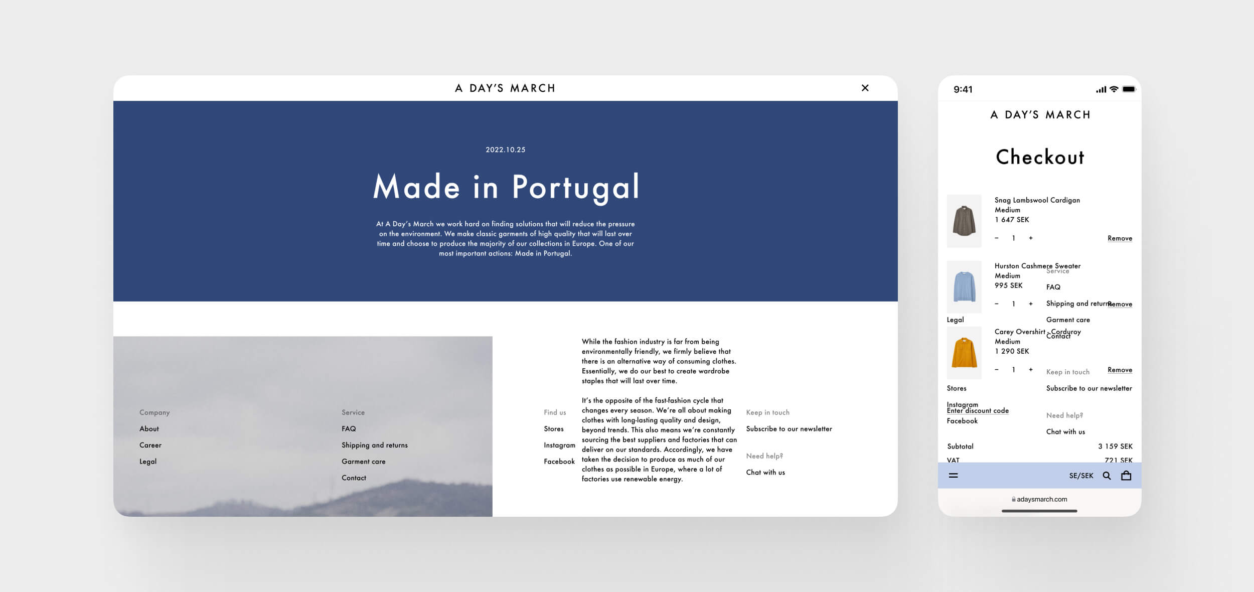
A Day’s March
Designing a new flagship web experience for a fashion brand deeply rooted in craftsmanship, aesthetics, and timelessness. The challenge was to translate the premium feeling of A Day’s March’s physical stores – designed with stone, wood, and subtle colors – into a clean, modern and editorial digital expression.
- Client: A Day’s March (via NoA Ignite)
- Year: 2022
- Role: Digital Designer (UX/UI)
- Platform: E-commerce website (mobile + desktop)
1.
The Challenge
The ambition was high: build a new e-commerce platform from scratch that feels just as carefully designed as a physical store. The brand’s philosophy of long-lasting quality and simplicity had to be reflected in every page – from landing pages to terms & conditions. Minimalism, contrast, white space and balance were central to the experience. At the same time, the platform needed to be flexible enough to support future storytelling and editorial content.
2.
My Role
As part of a small, design-driven team, I worked alongside a Lead Designer/Art Director. I contributed across all stages – from early concepts to prototypes, to building the design system and preparing the final handover to developers. My role involved:
- Concept development
- Prototyping and UI design
- Structuring the design system
- Designing for multiple screen sizes
- Ensuring pixel perfection in all components
3.
The Process
Design with Intent:
- We started by presenting several design directions to the client, focusing on different interpretations of the brand’s identity.
- After alignment, we built a modular and scalable design system tailored to different screen sizes and content types.
- Typography was handled with extreme care: one typeface, one weight, across the entire site – to create coherence and visual calm.
- White space, color accents and contrast were used deliberately to guide focus and enhance the sense of premium minimalism.
Collaborative Craft:
- Worked closely with A Day’s March founders and designers to ensure brand consistency.
- Designed editorial content areas to allow future storytelling and brand expression.
- Partnered with Ignite’s development team to ensure smooth design handoff and implementation.
4.
Key Challenges & Solutions
- Design system thinking: Built a scalable and cohesive system from the ground up.
- Visual balance: Balanced text, imagery and space to create rhythm and flow.
- Premium feel: Every UI detail – from buttons to error states – followed the same design philosophy.
- Editorial flexibility: Created space for rich content without cluttering the e-commerce journey.
5.
Outcome
The result was a premium, minimalist and timeless digital flagship – a site that communicates the same care and craft as the garments themselves. A flexible foundation that can evolve alongside the brand’s continued growth and storytelling ambitions.
6.
What I Learned
This project deepened my understanding of visual balance, restraint, and design craftsmanship. I learned to scale down without making the experience feel empty, and how small details create trust and elegance. I also sharpened my skills in delivering clean design systems ready for efficient handover to development.
7.
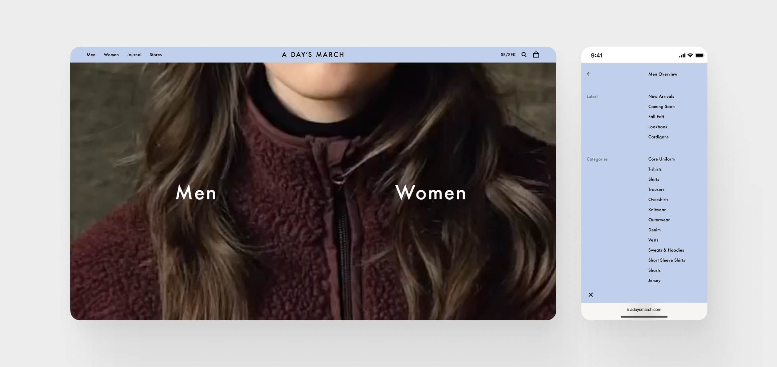
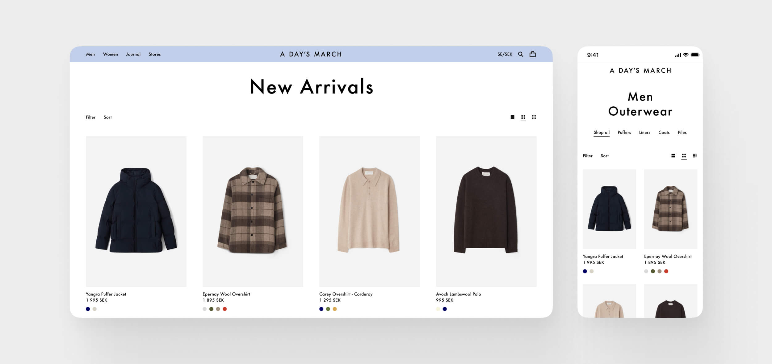
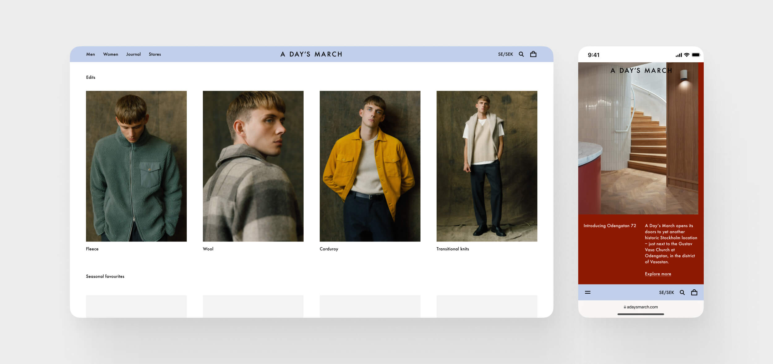
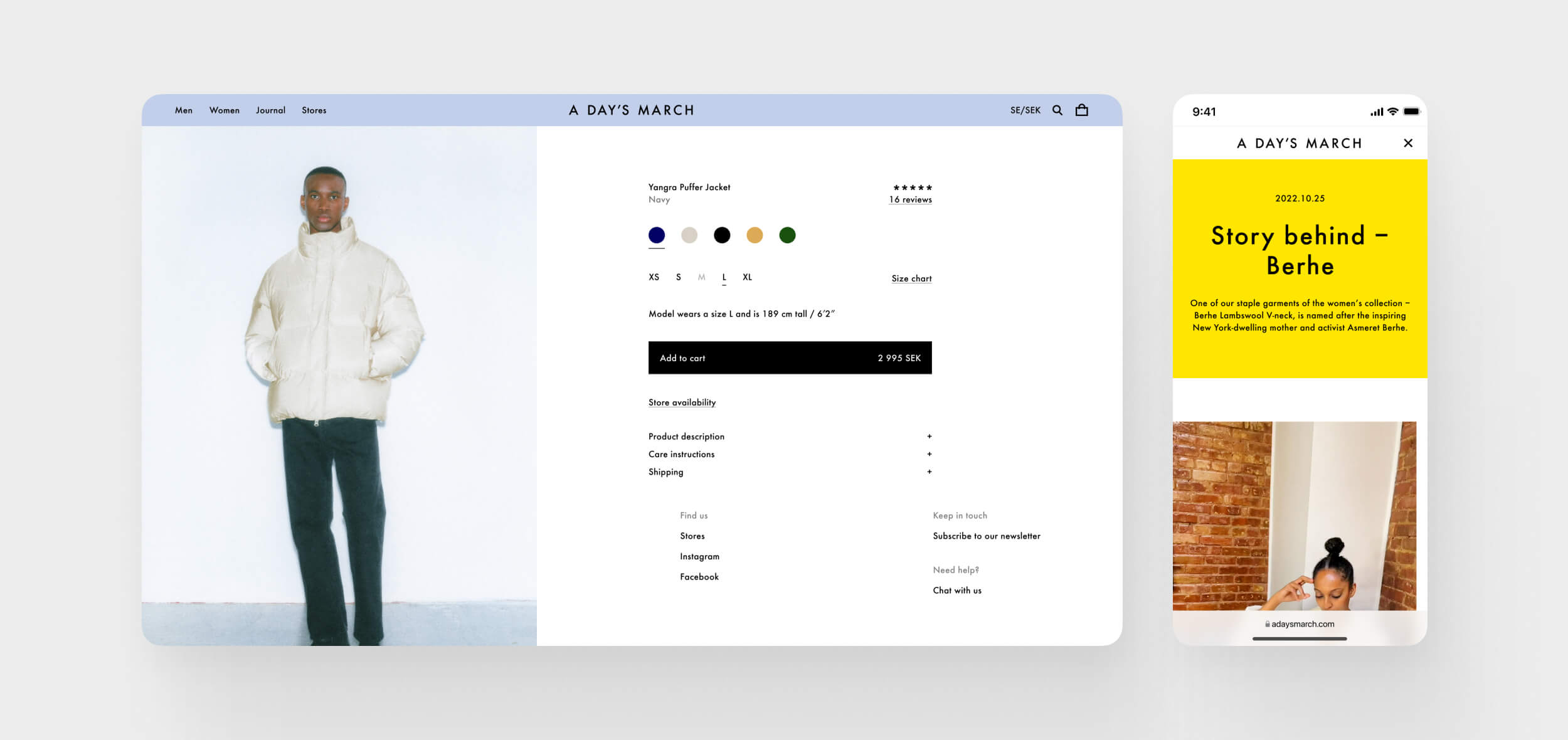
Visuals
Located
StockholmSweden
CONTACT
birk.janz@gmail.com
SOCIAL
Birk Janz
Work
About
Contact
Case
A Day’s March
Designing a new flagship web experience for a fashion brand deeply rooted in craftsmanship, aesthetics, and timelessness. The challenge was to translate the premium feeling of A Day’s March’s physical stores – designed with stone, wood, and subtle colors – into a clean, modern and editorial digital expression.
- Client: A Day’s March (via NoA Ignite)
- Year: 2022
- Role: Digital Designer (UX/UI)
- Platform: E-commerce website (mobile + desktop)
1.
The Challenge
The ambition was high: build a new e-commerce platform from scratch that feels just as carefully designed as a physical store. The brand’s philosophy of long-lasting quality and simplicity had to be reflected in every page – from landing pages to terms & conditions. Minimalism, contrast, white space and balance were central to the experience. At the same time, the platform needed to be flexible enough to support future storytelling and editorial content.
2.
My Role
As part of a small, design-driven team, I worked alongside a Lead Designer/Art Director. I contributed across all stages – from early concepts to prototypes, to building the design system and preparing the final handover to developers. My role involved:
- Concept development
- Prototyping and UI design
- Structuring the design system
- Designing for multiple screen sizes
- Ensuring pixel perfection in all components
3.
The Process
Design with Intent:
- We started by presenting several design directions to the client, focusing on different interpretations of the brand’s identity.
- After alignment, we built a modular and scalable design system tailored to different screen sizes and content types.
- Typography was handled with extreme care: one typeface, one weight, across the entire site – to create coherence and visual calm.
- White space, color accents and contrast were used deliberately to guide focus and enhance the sense of premium minimalism.
Collaborative Craft:
- Worked closely with A Day’s March founders and designers to ensure brand consistency.
- Designed editorial content areas to allow future storytelling and brand expression.
- Partnered with Ignite’s development team to ensure smooth design handoff and implementation.
4.
Key Challenges & Solutions
- Design system thinking: Built a scalable and cohesive system from the ground up.
- Visual balance: Balanced text, imagery and space to create rhythm and flow.
- Premium feel: Every UI detail – from buttons to error states – followed the same design philosophy.
- Editorial flexibility: Created space for rich content without cluttering the e-commerce journey.
5.
Outcome
The result was a premium, minimalist and timeless digital flagship – a site that communicates the same care and craft as the garments themselves. A flexible foundation that can evolve alongside the brand’s continued growth and storytelling ambitions.
6.
What I Learned
This project deepened my understanding of visual balance, restraint, and design craftsmanship. I learned to scale down without making the experience feel empty, and how small details create trust and elegance. I also sharpened my skills in delivering clean design systems ready for efficient handover to development.
7.
Visuals
Located
StockholmSweden
CONTACT
birk.janz@gmail.com
SOCIAL