Birk Janz
Menu
Work
About
Contact
Case
Arelion
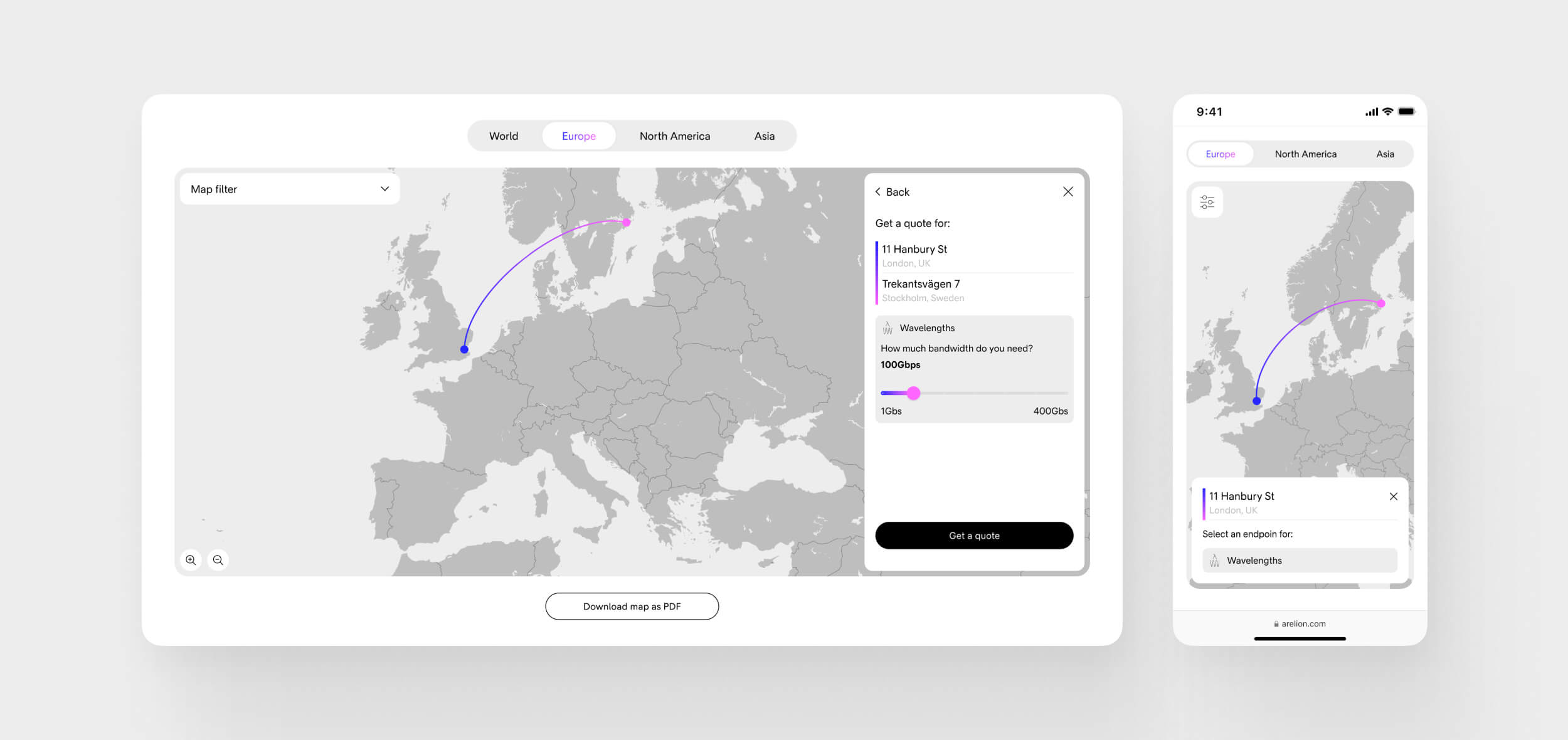
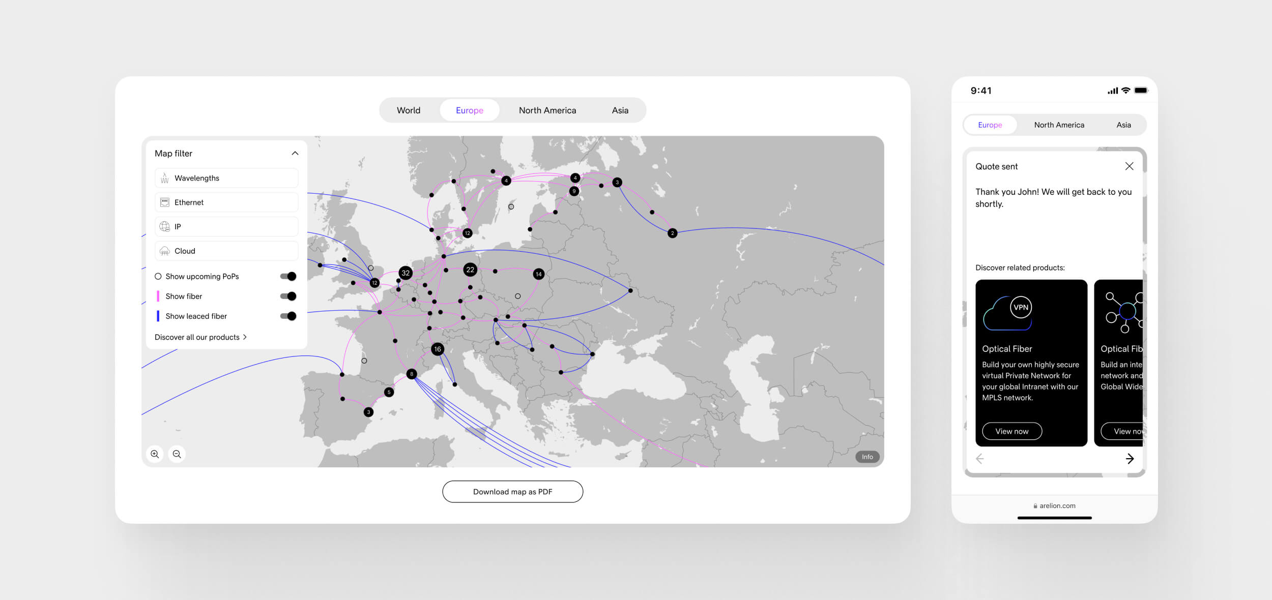
A complete brand transformation for a global B2B tech company – applied across multiple digital surfaces. I worked on redesigning Arelion’s website, internal platforms, and customer-facing tools. I also designed a custom-built, interactive map-based tool that visualized their vast global network in a way that empowered both customers and internal sales teams.
- Client: Arelion (formerly Telia Carrier)
- Year: 2021–2022
- Role: Digital Designer (UX/UI)
- Platform: Website, intranet, customer portals, data visualization tool
1.
The Challenge
Arelion had just launched a bold and detailed new identity. Every detail – from typography to micro-interactions – had to reflect this brand evolution. Technically, the challenge was to bring the identity to life across systems with limited customization. On top of this, I helped design a complex network visualization tool – aimed at simplifying massive datasets into an intuitive experience.
2.
My Role
I led UX and UI design across several tracks of work. This included adapting the brand identity to the existing website and internal platforms, as well as designing a completely new data visualization tool from the ground up. I collaborated closely with:
- Arelion’s internal stakeholders
- The creative director from their branding agency (Bold)
- International tech teams responsible for development and platform integration
3.
The Process
Brand Implementation:
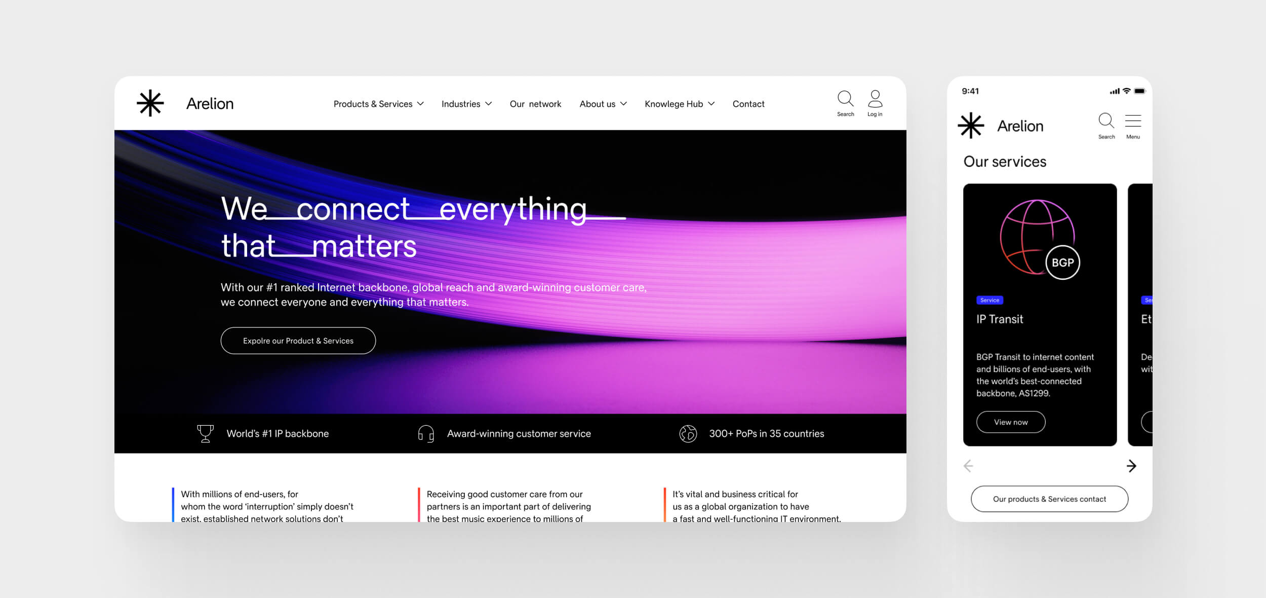
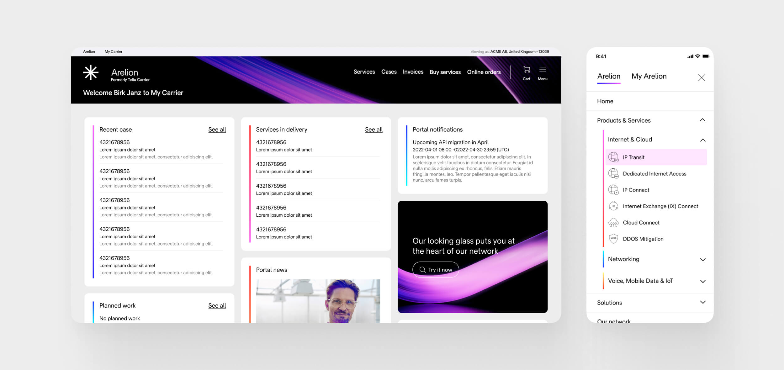
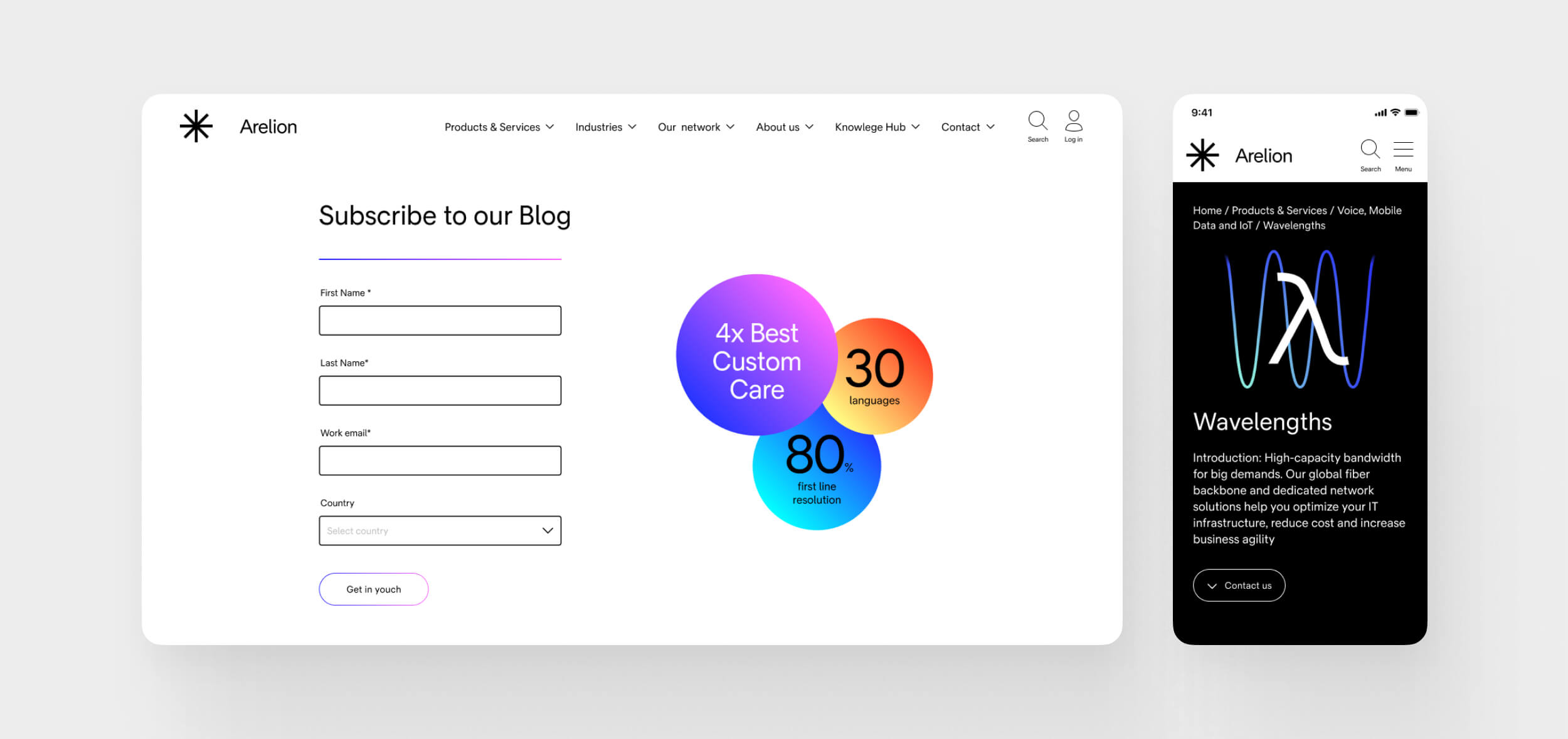
- Applied Arelion’s new visual identity across website, intranet, and customer portals
- Worked through detailed edge cases to ensure design consistency
- Aligned continuously with branding agency and internal dev teams
Data Visualization Tool
- Designed a map-based interface to display Arelion’s global infrastructure: cables, data centers, services
- Balanced two user types: internal sales teams and potential customers
- Structured massive amounts of technical data into a clean, explorable UI
- Prioritized clarity, accessibility, and brand feel
4.
Key Challenges & Solutions
- Tech constraints vs. brand ambition: Found creative ways to implement visual identity within rigid platforms
- Detail-driven design: Ensured every UI component aligned with brand intent
- Information overload: Transformed complex network data into a calm, understandable user experience
- Multiple stakeholders: Navigated input from branding, sales, tech, and business with frequent reviews and alignment
5.
Outcome
The result was a website that embodied the Arelion brand in every pixel – clear, bold, and modern. The map-based tool became a powerful asset for both sales and marketing, helping users explore and understand Arelion’s global offering in a more tangible way. The project was a strong example of cross-functional design collaboration at a high technical and visual level.
6.
What I Learned
This project reinforced the value of precision and alignment – especially when working across brand, tech, and business. I learned how to implement design at scale, and how to structure complex information for very different user needs. Most of all, I gained experience in turning abstract, technical systems into something intuitive and brand-forward.
7.
Visuals
Located
StockholmSweden
CONTACT
birk.janz@gmail.com
SOCIAL
Birk Janz
Work
About
Contact
Case
Arelion
A complete brand transformation for a global B2B tech company – applied across multiple digital surfaces. I worked on redesigning Arelion’s website, internal platforms, and customer-facing tools. I also designed a custom-built, interactive map-based tool that visualized their vast global network in a way that empowered both customers and internal sales teams.
- Client: Arelion (formerly Telia Carrier)
- Year: 2021–2022
- Role: Digital Designer (UX/UI)
- Platform: Website, intranet, customer portals, data visualization tool
1.
The Challenge
Arelion had just launched a bold and detailed new identity. Every detail – from typography to micro-interactions – had to reflect this brand evolution. Technically, the challenge was to bring the identity to life across systems with limited customization. On top of this, I helped design a complex network visualization tool – aimed at simplifying massive datasets into an intuitive experience.
2.
My Role
I led UX and UI design across several tracks of work. This included adapting the brand identity to the existing website and internal platforms, as well as designing a completely new data visualization tool from the ground up. I collaborated closely with:
- Arelion’s internal stakeholders
- The creative director from their branding agency (Bold)
- International tech teams responsible for development and platform integration
3.
The Process
Brand Implementation:
- Applied Arelion’s new visual identity across website, intranet, and customer portals
- Worked through detailed edge cases to ensure design consistency
- Aligned continuously with branding agency and internal dev teams
Data Visualization Tool
- Designed a map-based interface to display Arelion’s global infrastructure: cables, data centers, services
- Balanced two user types: internal sales teams and potential customers
- Structured massive amounts of technical data into a clean, explorable UI
- Prioritized clarity, accessibility, and brand feel
4.
Key Challenges & Solutions
- Tech constraints vs. brand ambition: Found creative ways to implement visual identity within rigid platforms
- Detail-driven design: Ensured every UI component aligned with brand intent
- Information overload: Transformed complex network data into a calm, understandable user experience
- Multiple stakeholders: Navigated input from branding, sales, tech, and business with frequent reviews and alignment
5.
Outcome
The result was a website that embodied the Arelion brand in every pixel – clear, bold, and modern. The map-based tool became a powerful asset for both sales and marketing, helping users explore and understand Arelion’s global offering in a more tangible way. The project was a strong example of cross-functional design collaboration at a high technical and visual level.
6.
What I Learned
This project reinforced the value of precision and alignment – especially when working across brand, tech, and business. I learned how to implement design at scale, and how to structure complex information for very different user needs. Most of all, I gained experience in turning abstract, technical systems into something intuitive and brand-forward.
7.
Visuals
Located
StockholmSweden
CONTACT
birk.janz@gmail.com
SOCIAL