Birk Janz
Menu
Work
About
Contact
Case
Billo
Designing a new kind of app from scratch – to handle something as physical as postal mail in a completely digital way. From early concepts used for investor pitches, to a testable MVP, and finally a polished v1 for launch, I worked end-to-end with UX and UI in a fast-paced, tech-driven startup environment.
- Client: Billo (via NoA Ignite)
- Year: 2021–2022
- Role: UX/UI Designer
- Platform: iOS, Android (React Native & Native)
1.
The Challenge
Billo set out to solve a unique problem: how to manage all your physical mail digitally, securely, and effortlessly. No competitor had solved this before. The challenge was not only technical – it was also about user trust. How do you convince users to hand over something as sensitive as their paper bills and legal documents?
2.
My Role
As part of NoA Ignite’s cross-functional team, I was the lead designer on the project. I worked closely with developers, system architects, and stakeholders to translate a complex technical service into a simple and intuitive user experience. My role covered both UX and UI for the MVP and later the native v1 app.
3.
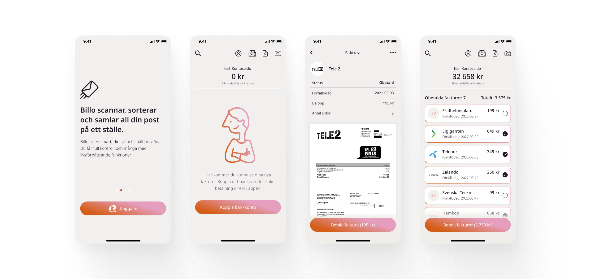
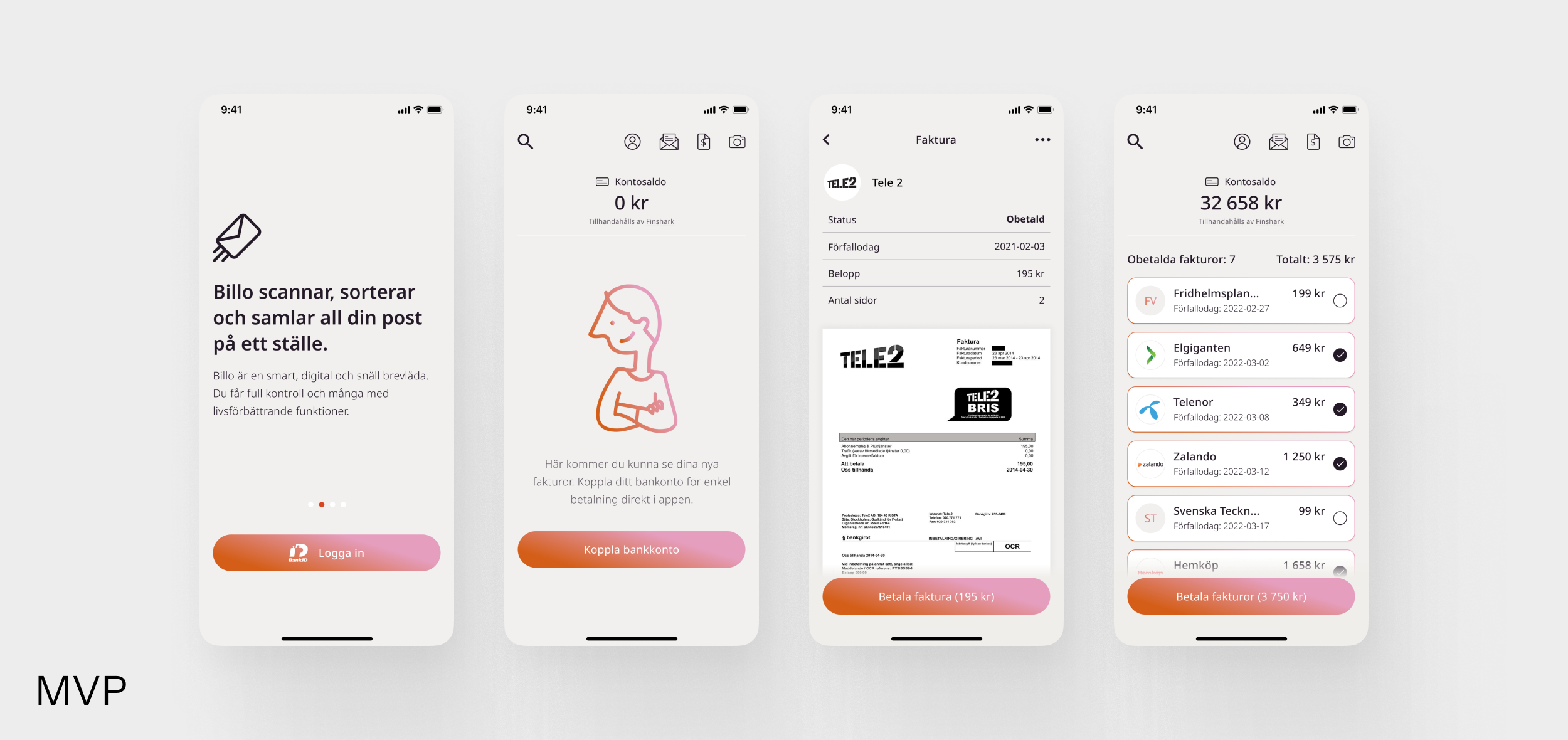
The Process
MVP Phase – Fast & Focused:
- Built in React Native for rapid development on both iOS and Android.
- Minimal interface, focused on UX flow rather than visual design.
- Created user flows for onboarding, BankID signing, and payment setup.
- Designed screens to handle legal agreements and secure permissions.
- Worked closely with developers to ensure feasibility and simplicity.
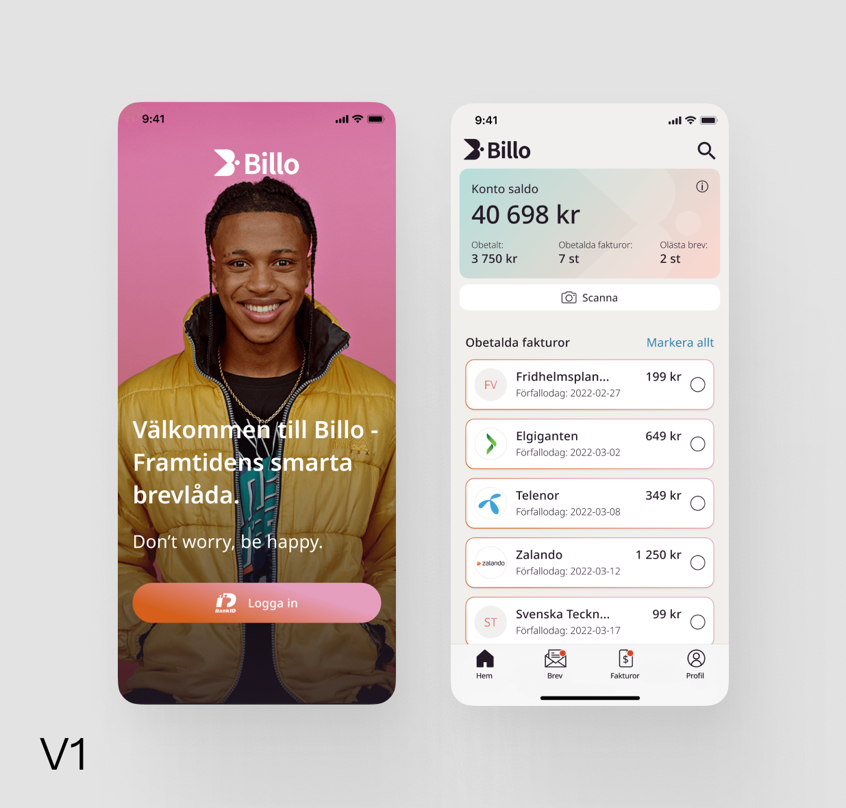
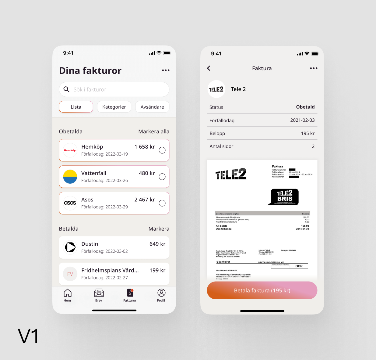
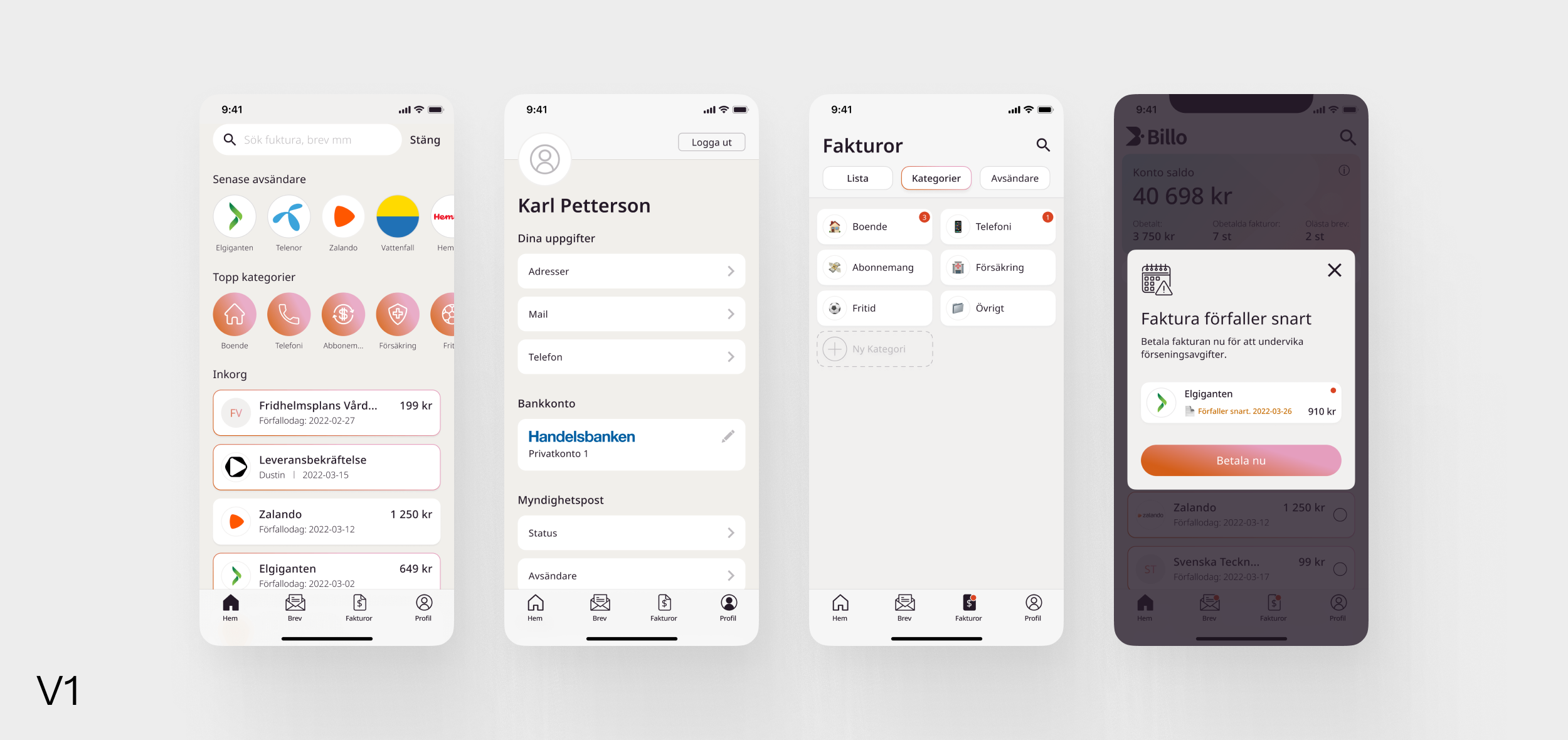
v1 App – Native, Brand-Driven, and User-Friendly:
- New navigation structure for better usability.
- Updated visual identity for a more branded experience.
- Refined hierarchy to clearly surface important information.
- Aimed for a sense of “calm emptiness” – the feeling that Billo handles everything for you.
4.
Key Challenges & Solutions
- MVP mindset: Prioritized only essential features for concept validation.
- Legal & security complexity: Simplified processes for signing, verifying, and connecting bank accounts.
- User trust: Designed flows that felt safe, clear, and low-effort.
- Tone & clarity: Paid extra attention to how terms and conditions were presented – transparency was key.
5.
Outcome
We launched a clean, minimal app that users described as “surprisingly simple.” The goal was for the app to feel empty – in a good way. A place where nothing required attention because Billo had already taken care of it. The app achieved a seamless onboarding experience and built the foundation for Billo’s in-house development team to take over.
6.
What I Learned
This project taught me the value of radical simplicity. I learned how to distill complex backend logic into user flows that felt effortless. I also gained deeper experience working closely with system architects and developers, making product decisions early in the life of a product. Following the project from blank page to launch gave me a strong sense of how structure, hierarchy, and navigation decisions shape the entire experience.
7.
Visuals
Located
StockholmSweden
CONTACT
birk.janz@gmail.com
SOCIAL
Birk Janz
Work
About
Contact
Case
Billo
Designing a new kind of app from scratch – to handle something as physical as postal mail in a completely digital way. From early concepts used for investor pitches, to a testable MVP, and finally a polished v1 for launch, I worked end-to-end with UX and UI in a fast-paced, tech-driven startup environment.
- Client: Billo (via NoA Ignite)
- Year: 2021–2022
- Role: UX/UI Designer
- Platform: iOS, Android (React Native & Native)
1.
The Challenge
Billo set out to solve a unique problem: how to manage all your physical mail digitally, securely, and effortlessly. No competitor had solved this before. The challenge was not only technical – it was also about user trust. How do you convince users to hand over something as sensitive as their paper bills and legal documents?
2.
My Role
As part of NoA Ignite’s cross-functional team, I was the lead designer on the project. I worked closely with developers, system architects, and stakeholders to translate a complex technical service into a simple and intuitive user experience. My role covered both UX and UI for the MVP and later the native v1 app.
3.
The Process
MVP Phase – Fast & Focused:
- Built in React Native for rapid development on both iOS and Android.
- Minimal interface, focused on UX flow rather than visual design.
- Created user flows for onboarding, BankID signing, and payment setup.
- Designed screens to handle legal agreements and secure permissions.
- Worked closely with developers to ensure feasibility and simplicity.
v1 App – Native, Brand-Driven, and User-Friendly:
- New navigation structure for better usability.
- Updated visual identity for a more branded experience.
- Refined hierarchy to clearly surface important information.
- Aimed for a sense of “calm emptiness” – the feeling that Billo handles everything for you.
4.
Key Challenges & Solutions
- MVP mindset: Prioritized only essential features for concept validation.
- Legal & security complexity: Simplified processes for signing, verifying, and connecting bank accounts.
- User trust: Designed flows that felt safe, clear, and low-effort.
- Tone & clarity: Paid extra attention to how terms and conditions were presented – transparency was key.
5.
Outcome
We launched a clean, minimal app that users described as “surprisingly simple.” The goal was for the app to feel empty – in a good way. A place where nothing required attention because Billo had already taken care of it. The app achieved a seamless onboarding experience and built the foundation for Billo’s in-house development team to take over.
6.
What I Learned
This project taught me the value of radical simplicity. I learned how to distill complex backend logic into user flows that felt effortless. I also gained deeper experience working closely with system architects and developers, making product decisions early in the life of a product. Following the project from blank page to launch gave me a strong sense of how structure, hierarchy, and navigation decisions shape the entire experience.
7.
Visuals
Located
StockholmSweden
CONTACT
birk.janz@gmail.com
SOCIAL